In our previous post we’ve mentioned two ways in which you can avoid bounce rates by means of mobile visual analytics. Here are a couple more that can get your users consistently engaged with your app’s features and provide a genuine onboarding experience.
Give The Best First Impression
Following the principle we’ve already stipulated – what you see is what you get – we’d like to make an adagio: what you see is what you get, and it’s really nice! Pinpointing the wonderful assets of your app on a firsthand basis will attract and engage the user. You can use a couple of introductory screens with simple messages containing the exact information your user wants to read. The key resides in powerful content: tell your users why your app can make a difference and why they shouldn’t choose a different one. Your purpose is to get the audience interested in your product and excited to try it out. It’s about narrowing down to a simple, clear and concise message what your app is really worth for. You’ll see it works!
The Power of Anticipation
With the help of friendly inline messages you can guide and assist your user, step by step, through the process of installing and functionally browsing your app. This will be helpful for him/her, but it will also boost his/her sympathy for the app and make the app itself more trusty and professionally built, because it shows care for the customer, hence a good UX.
Tumblr has been using this technique for some time now and it’s proven quite effective.
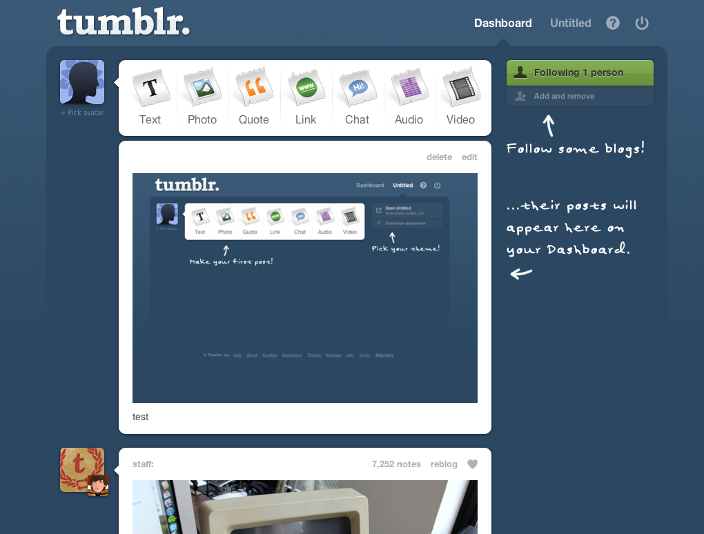
Photo Source: http://knewt.ly/1CuaY47
And speaking of Tumblr and their inline hinting strategy, check out their extremely intuitive buttons!
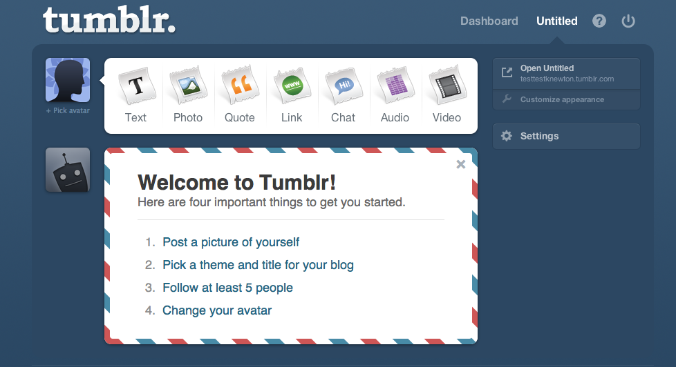
Photo Source: http://knewt.ly/1CuaY47
Use Analytics To Measure Your Onboarding Rate
Just because you feel you’ve created what is, in your mind, the perfect app in terms of user experience, that doesn’t mean the user will be quite as excited. Remember that you are the creator, so you’re in control and knowledgeable about every little thing that makes up your app. Your user isn’t, so make sure you’re always aware of how your users are actually using your app.
For this you can use touch heatmaps that will eloquently display where your users get constantly stuck, but also what they enjoy most about your app’s features. Getting a general sense of what your users’ behaviour is with regards to your app will tell you if you should think about re-designing it, improving it or letting it exactly as it is.
Another great tool in terms of relevance metrics are the real-time visual analytics reports. The real-time reporting system helps you accurately understand what the user is going through each time s/he accesses your app. An efficient method of analysis consists in focusing on new users’ first experience with your app. Their interaction is extremely valuable to you, because they have no idea where to go to and their success reflects the success of your app’s user experience.
There are many many more ways in which you can quantify and investigate your users’ share of likeness to your app, just make sure you start on the right foot and work on the best possible onboarding experience you can envision.