Great ideas are born out of nothing, and so do genius apps! You might have the most exciting app yet, but, as you know, it’s the little things that really count in keeping it out on the market and not hopelessly witnessing another one-hit-wonder going to waste.
Onboarding is the keyword in this equation. It means keeping your users engaged post-download and it’s the toughest thing on an app developer’s agenda. Here are a couple of tricks for you to explore and take into account when designing your next app!
Offer a Proper Introduction: Tutorials and Inline Hints
Every party is greater with a cool chaperone, so why not offer the same thing to your users with the help of clever inline hints and friendly tutorials. People using smartphones and apps are overall tech savvy, they will surely get the gist of your app in more or less time, but more time to understand your app means a greater chance of a high bounce rate. So crush the bouncing in the very bud and get your user and your app properly introduced!
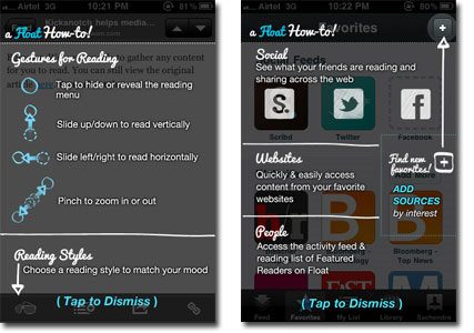
Simple, to-the-point instructions are what make a great tutorial for users. You don’t need too much information to teach your users the UI of your app. All they need to know in the beginning is “how it works?”; the details of finesse can be discovered by themselves later on. Inline hints, on the other hand, are the user’s permanent companions throughout his stay, so make sure you offer him the very best experience with the help of relevant icons and smart positioning. You can even combine the two and create a special mode feature, like the one displayed below, that will get your user going in no time:

Photo Source: http://bit.ly/1wNGsBt
The Art Of Submersion: Incite Them With An Overview
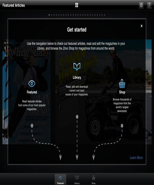
Showcasing the most important parts or elements of your app is what convinces the user to stay and come back afterwards. He’s gotten the gist of what your app is about and how it works, but he needs to be 100% in the loop as to its functionalities. Users are not very patient because there are plenty other “fish” in the Appstore, so what you need to do is show them that what they see is what they get. Not only that, but it also helps the user find quickly what s/he is looking for. A very important thing to understand about overviews is that they make the connection between what the user has learned in the induction process and how s/he applies it in the actual experience with the app. This has to be crystal clear to every one of them. Below you have an example of an overview gone right. You can tell why.

Photo Source: http://bit.ly/1qzMdRw
Stay tuned for our next post! You’ll find out more about keeping your users engaged post-download through mobile visual analytics.